How To Optimize Images for a Website

Robert Vija
SEO, Tech and Startup guy
14 minutes read
Images are usually one of the first things your readers and client see while visiting your website. Be it either a logo, a picture of your product, or a representative image related to your blog post, images have a great impact on how your website performs.
Because of this, Google and other search engines take image optimization very seriously!
Optimizing your images won’t automatically rank you in the first position. Still, it can give you an edge in SEO and help improve relevant metrics, such as conversion and bounce rates.
Image optimization isn’t that complicated, and there are tools that can help you out even if you’re not a web developer or SEO Expert.
What is Image Optimization?
Image optimization is the process of improving your images for search engines such as Google or Bing and for users. This is achieved by doing tasks like:
- Changing file formats
- Reducing file and image sizes
- Adding extra data such as alt descriptions or schema
- Improving the delivery of images
- Etc
These improvements help reduce data consumption, improve loading speeds, improve the experience for visually impaired people via website readers and allow search engines to better understand what that image actually represents.
Why is image optimization important for SEO?
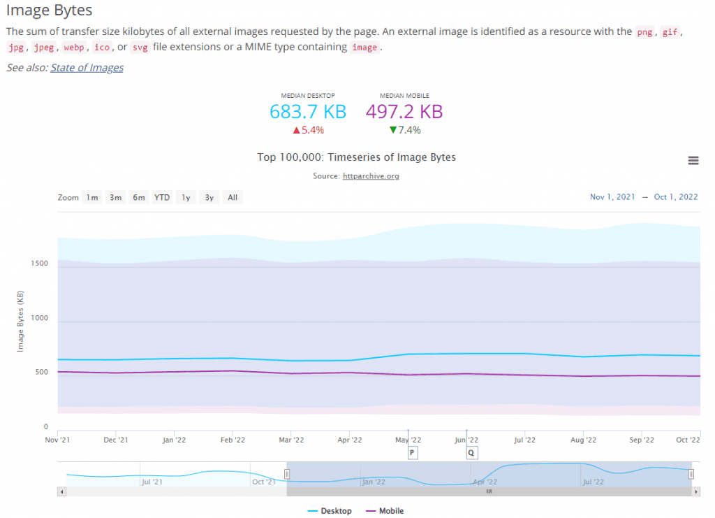
According to HTTPArchive, between November 2021 and October 2022, for the top 100.000 websites on the internet, images are responsible for over 30% of the data users download.
- Desktop: Total data 2039.3 KB vs 683.7KB - 32% of data
- Mobile: Total data 1708.9 KB vs 497.2KB - 29% of data
By reducing file sizes and ensuring that users only download the needed information, you help reduce the entire amount of data users download when interacting with your website.
This ensures better loading times and a better user experience.
Images you upload on your website can also get indexed in Google Image search or help increase the ranking of already indexed pages resulting in improved organic traffic.
Optimized images have more background information in the form of filenames and alt data. Search engines and screen readers can check this information, helping visually impaired users and search engines understand what the image is about.
How to optimize images?
Image files can be optimized in many ways, both before and after upload. In the following sections, you’ll learn general image optimization tips that can be used on any website, no matter how it was built, but also specific tips for WordPress or React and NextJs.
Resize Images
The first thing you should do is resize your images. A 4K image isn’t needed for a thumbnail.
Unless you are a photography business where pixel density really matters, you should serve the smallest size possible.

Take the image above, for example, downloaded from Unsplash, a website for royalty-free stock photos.
Unsplash provides the images at the highest quality possible for download. As such, when downloading the image above, you download over 3.06MB of data.
By simply resizing it to a smaller scale, from 5616px x 3744px to 1123px x 749px, you reduce the image to around 180KB, resulting in a file reduction of over 94% without any visible quality loss to the end user!
Image resizing can be done manually before the image is uploaded to the website, or automatically by the website (using custom code on the server or plugins for WordPress)
We’ll provide relevant image optimization tools below. Yet, for manual image optimization, you can either use:
- Gimp - A free image manipulation software
- Image optimization websites like simpleimageresizer or iloveimg
<div class="bg-white flex">
  <img class="mx-auto" src="your-url.png" />
</div>
The code example above uses HTML and CSS via Tailwind classes to add a white background behind an image and horizontally center the image.
For automated solutions, we that you integrate the following system into your website (you may need coding skills or the help of your developer).
When you upload an image file on your website, save it as a source file for your original image. Afterward, decide on a list of image sizes that are relevant to your website.
For example, you could have something like
- Full-size image - 5616px x 3744px - large image
- Product Thumbnail size - 800px x 800px
- Product Feed size - 400x 400px
- Blog post featured Image size - 680px x 360px
- Blog Feed image size - 300px x 300px
By having a list of image sizes present on your website, you can automatically create relevant images that can be served to the right user in the right place.
- site.com/image.png - large image
- site.com/image-800-800.png
- site.com/image-400-400.png
- site.com/image-680-360.png
- site.com/image-300-300.png
The server creates all of these images variants when you upload an image to the website and only delivers the relevant one to the user, depending on his flow inside the website.
This feature is used in WordPress image optimization and can be automatically done via the Image Component in NextJs on Vercel for React image optimization.
You can also create different image sizes for social media, delivering the exact image that Facebook, Twitter, or LinkedIn need!
Utilize Image Compression
According to imagecompressor.com, a free online tool for image compression, “Image compression is the act of encoding information using fewer bits than what’s found in the original file. Simply put, it means converting a large file into a smaller file.”
To put it in simpler terms, image compression makes images smaller, without any perceivable loss in quality for the end user.
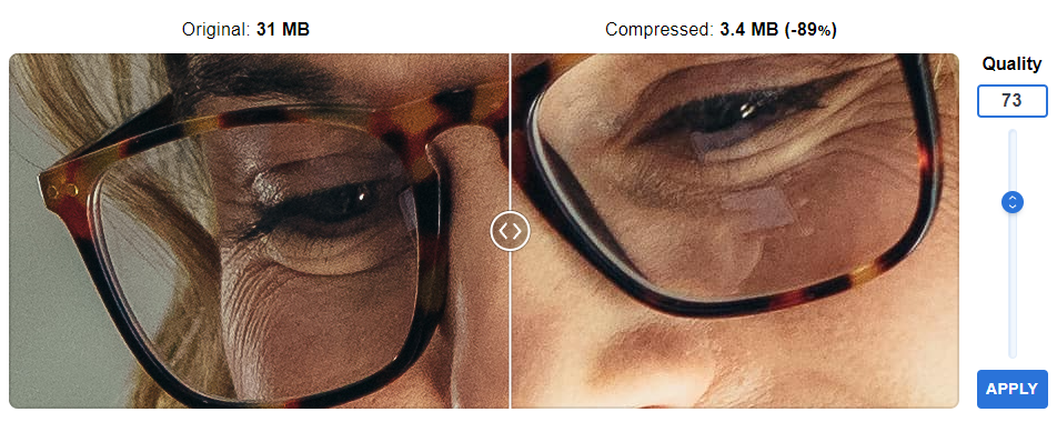
In the example above, by compressing a 31MB image, you can reduce more than 89% of its file size, without any relevant changes to quality.
Combine that with proper image resizing and other optimization techniques and you can provide the exact same image with an image file size of less than 1% of the original image.
As you can see, you don’t need to remove image quality in order to make an image smaller!
Shortpixel is a great solution to optimize images automatically via API or with a WordPress plugin. You can optimize over 7.000 images for just $4/month.
What types of image compression exist?
There are 2 types of image compression, lossy and lossless. You should know which one is relevant for you before compressing your images.
Lossy image compression can provide the biggest changes in file size, by removing insignificant data. Yet, used with the wrong settings, lossy compression will degrade image quality.
Lossless image compression provides the best image quality while still reducing file size. It won’t degrade image quality but offers bigger files as a result.
Change File Types
File types can greatly influence the filesize, quality, and aspects of an image. Knowing when to use a specific file type can greatly reduce unneeded data.
PNG (Portable Network Graphics)
A PNG is a lossless file format with full browser support that provides the highest image quality possible. It is also one of the only file formats that can provide background transparency.
There are only a handful of scenarios where a PNG is actually needed or useful:
- You need the best quality for an image allowing users to zoom in on details
- Your design needs images to have a transparent background.
If your use case is not one of the 2, you can shift to other smaller file types.
JPG or JPEG (Joint Photographic Experts Group)
First and foremost, there is no difference between JPG and JPEG besides the number of letters. In 1992, you couldn’t add more than 3 letters to a file extension, so they went with 3 letters. After things evolved, they also added the “e”.
A JPG is a lossy file format for images where you can tweak the compression ratio. The compression of an image in JPGs can only be tweaked down, meaning that it’s non-reversible. The quality or size of a JPG image cannot be improved.
It’s one of the most used file types right now, providing better file sizes than PNG, and, with the proper optimization, similar image quality.
WebP file format
The WebP file format was announced by Google in 2010 with its first stable release in April 2018. It was developed to replace JPEG, PNG, and other file types on the web.
It provides one of the best lossy and lossless compression, as well as transparent backgrounds and animations.
You should use WebP files whenever possible.
It’s a standard practice to provide a WebP image alongside a fallback. Meaning that, if your user’s browser can’t process WebP files, you should also provide a PNG or JPG image alongside it.
This can be accomplished by using the Picture element in HTML.
<picture>
	<source srcset="image.webp" type="image/webp">
	<source srcset="image.jpg" type="image/jpeg">
	<img src="image.jpg" alt="Your description here">
</picture>
By serving your images in such a way, you guarantee that the image will work, no matter what and that modern browsers can use the new optimized version of the image.
A WordPress website can use the ShortPixel optimization plugin in order to deliver all relevant image file formats.
SVG (Scalable Vector Graphics)
SVG is more drawings than images. The computer uses the data inside of the SVG to show an image that can be stretched to infinity and be as big as possible, without any loss in quality.
Because of this, SVGs or vector images are usually used as icons as they can be smaller in file size than a jpg or WebP without losing any quality, no matter the pixel size.
Normal images and pictures can’t be turned into SVG. The graphic needs to be made from scratch in an SVG-compatible format with a tool like GIMP, Figma or Adobe Illustrator.
Add Sizes Attribute to eliminate layout shift
A layout shift occurs when elements on your web pages change their size and position moving the content around them. This can negatively impact user experience.
A great example is the movement of a button when an image loads, having the user click at a different point because of the random movement of the button.
Because of this reason, Google decided to prioritize the elimination of layout shifts and gives a better score to web pages that solve this issue.
In order to fix this issue, images should have size attributes added inside of them, as to allow the browser to block that space for the image even before loading them.
<!-- Layout shift present  -->
<img src="image.png" />

<!-- Layout shift removed  -->
<img src="image.png" height="500" width="500" />
This fix can also be applied to other elements besides images, such as divs.
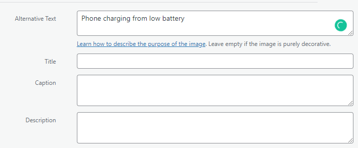
Add Alt attributes to images
The ALT attribute is an HTML tag added to an image that provides the browser and search engine with a description related to what the image represents.
It’s used by screen readers to help visually impaired people.
Using alt descriptions for product images can positively impact an ecommerce’s store ranking and increase organic traffic.
Try to keep them short and easy to understand. Usually, for eCommerce stores, adding the title of the product as an alt is sufficient. Of course, you can also add a little extension, as to add attributes of said product, such as color or price.
<!-- No ALT -->
<img src="image.png" />

<!-- Relevant ALT added -->
<img src="iphone-11.png" alt="Iphone 11 Second Hand Black" />
You can optimize images for WordPress by adding the Alt description in the media tab of WordPress.
This ensures that the alt description will be automatically added to the HTML of the images by WordPress.
If you’re using a react app with NextJs, you always need to add the alt description. (Of course, for purely decorative images, you can just add an empty string.
<Image src="me.png" alt="Your alt here" width={500} height={500} />Deliver responsive images
As stated when discussing resizing images, there is no need to deliver an image that is bigger than the device.
You can take that concept even further by creating different sizes depending on the device (mobile or desktop). Also, you can change the image format entirely depending on the device.
For example, you may want a landscape image on a desktop, and a portrait one on a mobile. This can happen when you share screenshots from an app, you’ll want to show a screenshot that is relevant to the user.
Responsive images can be achieved in 2 ways, picture elements with multiple sources or img elements with a srcset attribute based on the media query.
<!-- Picture element -->
<picture>
	<source media="(max-width: 799px)" srcset="mobile-screenshot.jpg" />
	<source media="(min-width: 800px)" srcset="desktop-screenshot.jpg" />
	<img src="desktop-screenshot" alt="Desktop screenshot of a SaaS" />
</picture>

<!-- Image Element -->
<img srcset="mobile-screenshot.jpg 480w, desktop-screenshot.jpg 800w" src="desktop-screenshot.jpg" alt="Desktop screenshot of a SaaS" />
Preloading the main images
Preloading images instructs the browser to first download an image, before working on other tasks on your web page. This can help deliver the first relevant design to the user faster, while the browser loads other, non-essential scripts after.
This will also affect the LCP (Largest content paintfull), a metric used by Google in ranking, that showcases the time needed for the web page to load almost all of its design.
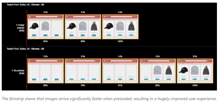
In the photo above, provided by web.dev, you can see how a web page loads, when the images are preloaded vs when they are not.
Preloading images is done via a link element added inside the header of the page, using a code similar to the one below.
While preloading responsive images, the browser will only download the needed image based on the device. If you preload multiple images that you do not need, you will negatively impact your loading time.
Integrate Lazy loading
Not all images should be downloaded right as the web page loads. In many cases, the user may not even need to see them.
Let’s say you have an e-commerce store with 60 products on a page. As soon as the user enters the page, he can see only a couple of products and needs to scroll to see more. As a result, he doesn’t need all of the images upfront, only the ones that represent the first products.
The other can be downloaded as soon as the user scrolls, resulting in a better experience and faster loading times.
In order to lazy load an image, all you need to do is add a loading attribute on the image, with the value of “lazy”.
<!-- Image Element with lazy loading -->
<img
  loading="lazy"
  src="desktop-screenshot.jpg"
  alt="Desktop screenshot of a SaaS"
/>;
The ShortPixel optimization plugin can automatically lazy load images for you in WordPress.
While using NextJS, the Image component will also do this for you as well and most other React components do this out of the bat as well.
Serve images via CDN
A CDN or content delivery network is a group of servers distributed all over the world with the purpose of serving data from a closer location to the user.
By using a CDN, you make sure that a user from Australia will download the data from an Australian server, not from one in the US or Europe.
CDNs do this by copying the data from the source (your server) and distributing it to as many nodes as possible.
By using a CDN, you also increase security and improve loading times.
The CDN will also help with image caching, by changing the caching rules on the image. By doing this, a user that visited one of your pages will keep the image downloaded in their browser until they close the browser.
By doing this, if the user visits a product page multiple times, all but the first visits will be almost instantaneous, as they won’t need to redownload the images.
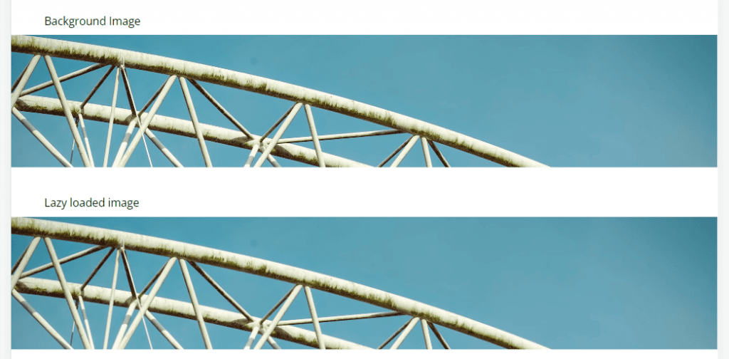
Don’t serve background images via CSS
Images served as background images via CSS are hard to optimize because of the following reasons:
- You can’t lazy load them.
- They are downloaded only after the browser reads all the CSS files, which can take a while and negatively impact your user experience and loading times.
Instead of using CSS to call a background image, instead, position the image using absolute values inside a relative div.
In the example below, you will see that both images look the same, but are implemented in 2 different ways.
<div class="grid gap-10 py-16">
<div>
<p class="pl-12">Background Image</p>
<div class="h-48 bg-gray-200 bg-cover" style="background-image: url("https://images.unsplash.com/photo-1673017987376-cfb1f3936227?ixlib=rb-4.0.3&ixid=MnwxMjA3fDB8MHxwaG90by1wYWdlfHx8fGVufDB8fHx8&auto=format&fit=crop&w=2071&q=80");"></div>
</div>
<div style="">
<p class="pl-12">Lazy loaded image</p>
<div class="h-48 bg-gray-200 relative overflow-hidden">
<img loading="lazy" class="absolute top-0 left-0 object-cover" src="https://images.unsplash.com/photo-1673017987376-cfb1f3936227?ixlib=rb-4.0.3&ixid=MnwxMjA3fDB8MHxwaG90by1wYWdlfHx8fGVufDB8fHx8&auto=format&fit=crop&w=2071&q=80" alt="">
</div>
</div>
</div>Image Optimization Tools
There are multiple image optimization tools that you can use, both manual and automated. We’ll also discuss which tools you can use on your own computer or via WordPress or integrated into a custom app via API calls.
Manual optimization Tools
GIMP
Gimp is a free and open-source image editor. It works in a similar way to Adobe Photoshop. You install it on your computer and use it to edit images.
By using GIMP you can resize, crop, change file formats, and optimize images fast and easily. You can also install extensions to GIMP, allowing you to create presets, which are useful when bulk optimizing multiple images (really useful if you optimize a gallery for e-commerce for example).
Optimizilla
Optimizilla is a free-to-use website that easily compresses images for you. I use it when I just need to optimize one image on the fly, being faster than Gimp.
Just drag and drop your image and download the new and optimized version.
With Optimizilla, you can easily compress up to 20 images. The website allows you to compare the original and optimized version, as to make sure the quality is still high.
TinyPng
TinyPng is also a free-to-use website for image optimization. Just drop up to 20 images and download your optimized version.
Automated image optimization tools
ShortPixel
I know I’ve mentioned Shortpixel multiple times during this article, but they are doing a great job, especially in the WordPress ecosystem.
Their WordPress plugin takes care of multiple image optimization tasks such as
- Resize images
- Compress images
- Serve images via CDN
- Make images responsive
- Changing file format
All of this is done automatically as long as you have the plugin installed, and you pay as low as $4/month for a limited number of images or pay $8.25/month for unlimited optimization.
Of course, they also have a free version that you can try.
For the web developers out there, Short Pixel also offers various APIs that you can use in your apps.
Cloudinary
Cloudinary is a great service that optimizes images. It is a little more on the expensive side, yet, it can be of great use for bigger businesses, especially the ones that have an eCommerce store.
Cloudinary can also be used for:
- Media Storage
- Editing images on the fly
- Image optimization
- Image automated tagging (getting data related to what is in a photo)
Frequently Asked Questions About Image Optimization
What is the optimized image size to use on a website?
For pixel sizes, an Image should always be equal to the design of which it is part. If you’re using an image as a thumbnail that is 500px in width and 500px in height, then the image should also be the same size.
Don’t go overboard and use smaller images, as this could make the image blurry.
For file size, try to always keep it lower than 300kb for full-screen images and less than 150kb for other smaller pictures.
How to optimize my website images in bulk for free?
If you’re using WordPress, you can use the free version of ShortPixel.
Otherwise, you can download the free software GIMP and use its bulk option for image optimization.
What are Google's tips for image optimization?
Google has a video and webpage for tips and tricks on image optimization. We have talked in this article about all of them in detail. Yet, we do recommend taking a look at the Google page as well.
How to get my pictures to appear high in Google Images results?
In order to get images to appear higher in Google Images results you should:
- Upload original pictures
- Use relevant alternate descriptions
- Use descriptive file names
- Optimize the images
- Get backlinks to them or get them used in relevant articles
Do images in blog posts help SEO?
Images improve your chances of ranking higher. Google ranks pages that are relevant to users, and articles with descriptive images provide better value to users and as such, will be properly indexed by search engines.
What are the best WordPress plugins for image optimization?
The best WordPress plugin for Image optimization is ShortPixel. It can help with image resizing, changing file types, using responsive images, and compressing images for lower file sizes.
Conclusion about image optimization
Optimizing your website’s images for the web can greatly improve both your web ranking and the user's experience.
While this task can seem a little complex, there are many tools that can automate it for you, allowing you time to do what you do best and grow your business.
What do you think, is there anything we’ve missed? Are there other ways to optimize your images? Tell me in the comments and let’s chat.